How To Design a Pricing Page That Converts
The problem with many pricing pages out there is that they are developed either as a masterwork of graphic design to illustrate the graphic designer’s skills or put up hastily to quickly kick off your business. The pricing page is most critical for your business, yet it is often among the neglected pages.
Looking for the price is a natural part of the buying process. If your pricing page is not designed with the goal to convert, you will possibly lose potential revenue. It is time to look back at your pricing page and make it useful and conversion oriented.
Here’s how you can do it.
A Simple Pricing Page Is User-friendly
Keep your target customers in mind when designing the pricing page. Customers mostly skim through the pricing page, and you must help them make a decision without wasting their time.
Do not overburden customers with huge information because it will keep them from clicking on the CTA. A simple pricing page is user-friendly. Communicate the most important message in as few and simple words as you can.
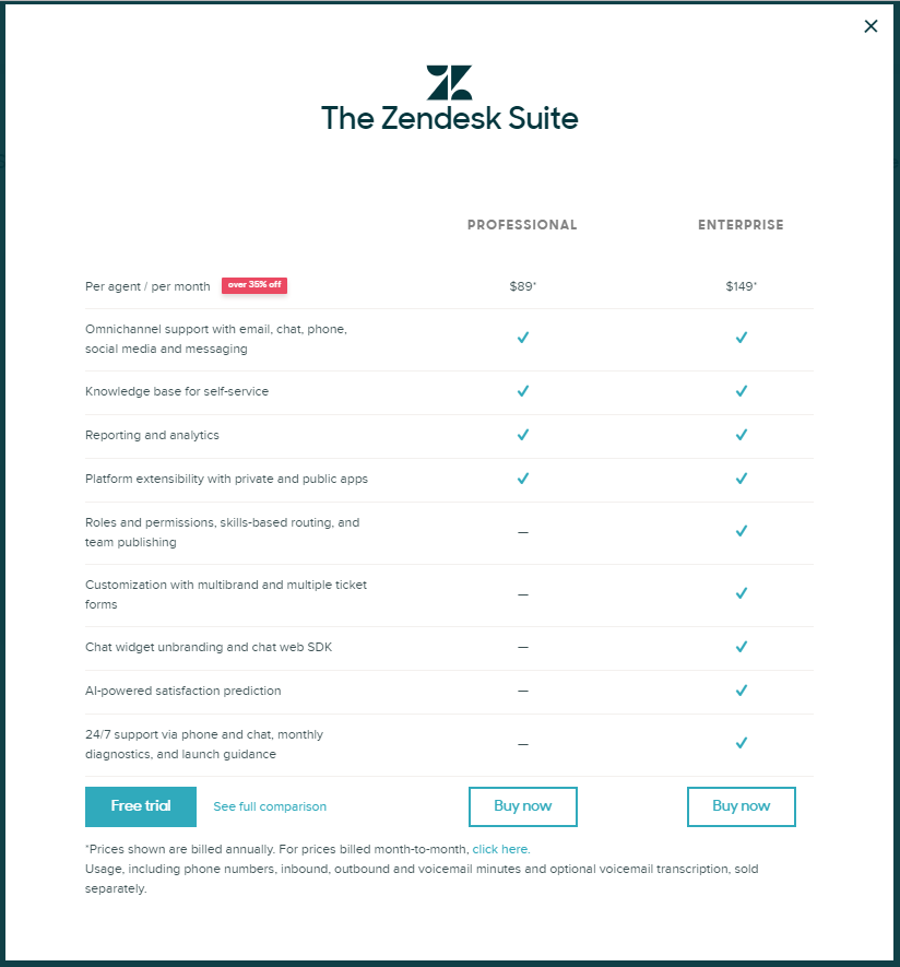
Zendesk has one of the simplest pricing pages.
Keep the psychology of pricing in mind
Do you know why the prices for most products end in 99 cents? Well, there is a whole psychology behind it. It is that human beings have a natural propensity to match two prices beginning with the left-most digits. When the numbers are different, they stop there and make their estimation.
Retailers have used this trick for ages now. And you can use the same method on your pricing page. However, the use of this trick differs from business to business. You should first do thorough research and zero in on an effective strategy before implementing the psychology of pricing.
Here’s an example of how the psychology of pricing can be implemented on the pricing page:

List the expensive plans first and recommend an option
Listing the expensive plans first (on the left) is an excellent way to increase your conversion rate. It can deliver better results when you concisely mention the benefits of each plan alongside.
Also, consider recommending an option (one that is most profitable for you). Highlighting the recommended option can boost your revenues even more. Use small icons and bullet points to emphasize the benefits of each plan.
While mentioning the benefits of each option is the best option, many enterprise customers also want to see the features of each pricing option. Keep this thing in mind when designing the pricing page.
Check how smartsheet has listed the expensive plan first.

Offer a free trial
If you are selling software, it makes sense to offer a free trial. Many people will look for a free trial option on the pricing page. Customers may want to use the software before making a decision. When they are satisfied with the trial, they may buy the software.
Do not ask the users to provide credit card information to use the free trial. Most people are usually unwilling to give out their credit card information unless they have made a buying decision.
Workspaces offers 3—day free trial on all plans.

Put a call-to-action on the page
A call-to-action on the pricing page can make it easy for your customers to purchase a plan. But the key here is to keep the CTA simple yet prominent and enticing for each plan. Do not let it sound too assertive. If you fail to make it easy for the customer to take action, it can give them more time to change their decision and exit the page.
Here’s an example of an effective CTA.

Include social proof on the page
Social proof on the pricing page can make you look more human and available. It can positively affect the customer’s buying decision. Consider putting human faces, logos, customer testimonials, videos, and social media posts on the pricing page.
Add FAQs on the page
Your customers may have questions in their minds when they skim through your pricing page. Answering the frequently asked questions on the page can help the customers make a quick decision. You can put the FAQs section at the end of the page or under the pricing tiers. Your answers to the FAQs can ward off some of the most common sales objections before they can occur. When appropriately implemented, the FAQs section can help you break the competition.
Takeaway
Majority pricing pages have similar elements. And most have identical features and functions. The use of generic features and options will not make your pricing page conversion-oriented. The most effective pricing pages give customers everything they need to make a decision and making the buying process smooth and quick. Now that you know what it takes to design a pricing page that converts, it is time to apply these ideas and see amazing results.
SOURCES:
https://www.invisionapp.com/blog/pricing-page-design/
https://www.newbreedmarketing.com/blog/nine-best-practices-for-saas-pricing-page-design
https://www.process.st/saas-pricing-pages/
https://blog.chartmogul.com/saas-pricing-pages-2017/
https://neilpatel.com/blog/pricing-page-that-converts/
https://yourstory.com/2017/03/create-perfect-pricing-page/
https://conversionxl.com/blog/10-principles-of-effective-pricing-pages/